[Tutorial] Dealing with quotes

Generally I recommend that you keep text to a minimum on your slides, but sometimes you can use text – even long text – to good advantage. Specifically, when you want to quote someone or some document.

Quotes come in handy in several situations:

  • When you want to appeal to some authority to support your argument or set the stage
  • When you have a requirement that you need to satisfy and you want to make it clear that you are responding to the requirement
  • When you want to avoid any suggestion that you are taking something out of context

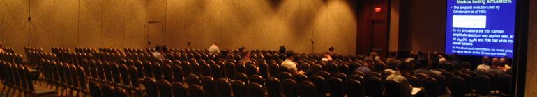
Now, usually when you throw up text your audience turns you off while they read the text. And, having read the text, they usually find that the speaker is reading the text out loud. And usually the audience will try to “read ahead” and figure out what you are going to say next. If you are lucky, everything is clear and they simply grow bored while you make your case. If you are unlucky, things are confusing and they turn you off completely while they try to make sense of it all. Either way, though, you’ve lost the audience.

The way to avoid this is to keep the audience from reading everything, and thus keep them focused on you. The way to do this is using emphasis. Consider the following example:

Initial Slide

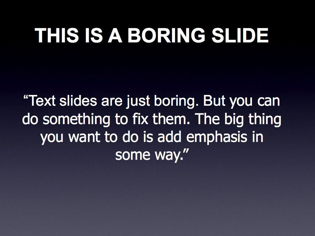
This is a very boring slide – it says so at the top. And the text itself is not particularly shocking. So what can we do to spice it up?

The first step is to find the words – ideally just a handful – that captures the essence of the point you want to make. Then we try to emphasize those words above the rest. Easy so far. But how do you emphasize the words?

One way is simply to take the words and make them bold. This is what it can look like:

Boring quote with bolded words for emphasis

Now, you can see the emphasized text, but just barely. I find that a simple bolding rarely words, but your mileage may vary. Let’s try to spice it up a bit more – let us add an underline:

Boring text with bolded, underlined words for emphasis

Now this is better – the combination of bold and underline really brings out the emphasized words, and you can read the essence: “Text boring. Fix them. Add emphasis.” This is what your audience wil l read, and then they will focus back on you. And – as an added bonus – because you have emphasized these words, you are less likely to read the whole quote (hint: never read the whole quote – your audience can read faster than you can speak).

So – can we do better? Yes. Let us first step back and – instead of underlining – let us add some color:

Boring quote with color

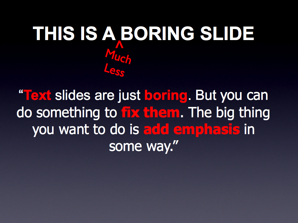
This looks really good – at least I think so – but let us take it that final step. First, let us lose that stupid header – most slides really do not need a header. Then, let us add a relevant picture – say of the devestatingly handsome man who we are quoting:

Boring quote with color and picture

There we go – color, emphasis, and relevant graphic. This will help you keep the audience interested and focused on you. Try it next time you are tempted to use a long quote.

Presentation Zen review

Title: Presentation Zen: Simple ideas on presentation design and delivery

Author: Garr Reynolds

I’ll give you the bottom line up front: It’s a good book, and you’ll learn stuff. But I didn’t like it as much as I hoped I would.

I may be the victim of anticipation. Y’see, the book stems from an excellent blog called – wait for it – Presentation Zen by the author of the book. And I really like the blog. I don’t read every article, but the ones I do are excellent. And the blog turned me on to TED, so how far wrong could it steer you?

And the book is, well, pretty. The colors are bold and permeate the book. The fonts are nice, the sections well laid out. Just thumbing through the book gets you excited about reading it.

And that is probably the problem. The expectations were built up that this book was *made* for me when, in fact, it wasn’t.

The hints are right up front. The title of the book – Presentation Zen – sets the stage. The opening section, where the author waxes lyrical about the simplicity inherent in the Japanese Bento boxed lunches. The whole thing.

My issue is that the book puts too much emphasis on Zen, and not enough on presentations. At least for me.

This is best exemplified by the final section of the book, on the on-stage presentation. The author goes on at length about “being there,” about not thinking and just doing. About the point where the swordsman and the sword are one and technique is subsumed by the simple act of swordsplay.

Which is good, as far as it goes, but there is very little about interacting with the audience, about making eye contact, about interacting with the slides, about what to do with your hands, about managing your stress. The swordsplay stuff is the ideal to which you should aim, certainly, but if you are reading his book you are not there – quite possibly by a long way. And that is what I thought was missing form the book.

Okay – enough negativity. What is *good* aout the book?

I think the book hits it’s stride when talking about design. When discussing slide design Garr Reynolds has no equal – the emphasis on relevant graphics, the use of fonts, the positioning of elements in a slide – it is all presented well and it is all excellent advice. The Zen aspect of simplicity comes through best here. You would do well to read this book simply for the design aspects alone.

I also totally buy into his presentation planning suggestions. The idea of going analog before going digital is, as I have discussed before, entirely the ideal way of doing things. Now, Garr lives a rather different life, where presentations are his entire business, instead of the small part that it is in a scientist’s or engineer’s life, so one needs to apply the principle and not get jaded by some of the examples he quotes. But the bottom line is that this is all good stuff.

So, should you read the book? Yes – if ony for the planning and design sections (his gallery of presentations is a joy to behold). Does it apply wholeheartedly to the technical professional who is, perhaps, far from the ideal? Probably not. But you *will* come out a better presenter for taking his advice to heart, and for that I have to recommend the book.

Just don’t get caught up in how pretty it is on the outside….

[Commentary] Review – Why Most PowerPoint Presentations Suck

Review: Why Most Powerpoint Presentation SUCK (and how you can make them better)
Author: Rick Altman
Publisher: Harvest Books

The best way to start this review is to make it clear what this book is:

70%: PowerPoint tips, tricks & techniques
20%: Speaking tips
10%: Multimedia advice
0% : Focus on scientific presenting

So, with the caveat that this book is what it is, it does it very well.

Let us start with the author. Rick Altman hosts the annual PowerPoint Live conference, dedicated to helping presenters become better presenters. As such, he is both exceptionally knowledgeable about PowerPoint, and is very engaging in his style. The writing style is very conversational and easy to read, making this an easy book to pick up and enjoy.

The book contains 21 chapters, with each chapter broken into easily digestible chunks. The book is peppered with pictures – from slide formats to actual PowerPoint menus to help the reader understand what he is doing. One of my few complaints about the book is that these pictures are all in B&W, not color.

The other complaint is almost unfair, but it stems from the authors expertise with PowerPoint. In short, by about the halfway mark through the book I started getting tired of all the neat tricks he showed on how to use obscure (and, admittedly, some not-so-obscure) PowerPoint features.

My complaint stems, I think, from my belief that you don’t make a PowerPoint presentation suck less by making it more glitzy (something that the author recognizes, and states himself repeatedly), but by dealing with basic presentation techniques. As such, I think that the book is somewhat mis-named. Something like “Making PowerPoint Dance” would have been a more accurate title in my mind.

That said, if you accept the book for what it is, and not for what you might want it to be, then it is a very good book, and I would recommend it for someone who wants to see what PowerPoint can do in the hands of an expert. And if you just want to make your presentations better, well, pick it up anyhow, but don’t feel that you have to read the last half of the book.

That said, I’m downloading his PowerPoint samples, and I’m sure some of the tricks will find their ways into my next slide package.

Analog first – *then* digital

So, I’ve got a presentation lined up for next week. I’ve talked about this stuff before. Take a couple of slide decks, add a few slides to reflect new work… This is gonna be *easyyyy*

First, lets find those decks. Hmmm…. where did I put them? Okay – let’s try this directory. That one sounds right. Fire it up…. Nope – not what I was thinking of, but I like those slides – let’s keep this one open.

Now the next directory… Aww – forget it. I’ll use my desktop search. Great. 25 matches. Wait – that’s the one that I want. Terrific. And those two – yep – they’ve got some slides I want.

Great. Now, let’s take my base presentation and change the name. Now let’s import some possibly useful slides. Okay… can I just copy/paste? No – weird things happen with the formatting. Let’s import slides from file… great – what directory are those other slides in? Bring them to the front, one by one. Get file info. Okay… Browse…. what slide numbers do I want? Okay – there they are. And now they are in. Other slides packages, same dance.

Finally – I’ve got my slides. Let’s look at these. Oh geeze – Times New Roman in some slides, Arial in others, and what’s this other font? Nope – can’t use that one – I don’t trust the machine I’m going to use to have the fonts. Okay – let’s make it all Arial. I *hate* arial, but it’s sans serif and every machine has it. Let’s go to slide master, change all the fonts. Apply. Good. How’s that?

Damn – I forgot the text boxes. I have to go and fix those individually. Geeze..*how* many slides? Okay – gonna have to cut that back. And what’s with all those damn bullets? I gotta have a graphic that’ll work better than that.

Hold on – what did I want to talk about? Oh geeze – this is all crap. Damn. Okay – let’s start over. File… New Presentation….


I don’t know about you, but all to often I go through something like the above. A presentation that should be a”gimmee” becomes an hour of busywork before I realize what I’m working on is total garbage. It shouldn’t be that way though. It doesn’t *have* to be that way.

Go analog first. Turn off your screen (you’ll only be distracted by the e-mail anyhow). Get out a pad of paper and a pen. Find a comfy spot if you can. And start thinking about what you want to say. Don’t worry about the slide decks you already have. Just sit down and write out a few points. Now lay them out into the order you want. Make a few notes about the graphics you want. Maybe sketch out an arrangement. If there are some key phrases or themes you want to use, write them down.

Make a mistake? Scratch it out. Rip up the paper, start over. Doesn’t matter.

Note what is happening here. By going analog you are concentrating on your content, not on the fonts, not arguing with your slide software, not searching for a missing slide package. Sure – you may end up doing that later, but at least you will have a clear idea of what you want. The presentation has taken precedence. After you’ve sorted out the presentation, then turn your screen back on and work on creating the slides.

In the end you will have saved time, and your presentation will be stronger because you focussed on it early and clearly. Try it.

Analog first. Then go digital. Your audience will thank you.

[Commentary] Review of “The Craft of Scientific Presentations”

Having gotten it into my head that – in general – technical folks need some help to make their presentations better, I decided that one of the obvious things to do was to take a look at resources that purport to do exactly that. I certainly do not claim to have all the answers, and it is always useful to see what others have to say and, besides, reviewing these resources would be fodder for this blog. So – with that in mind – my first book review:

Title: The Craft of Scientific Presentations
Author: Michael Alley
Publisher: Springer Science + Media, 2003

I was intrigued by this book as soon as I saw the title. Instead of speaking of the “art” or the “joy” of scientific presentations, the author chose the word “craft.” I appreciated the intent of the wording – after all, the word “craft” implies work and attention to detail, both of which are components of a successful presentation. At the same time, though, it seemed awfully calculating

The subtitle to the book – Critical Steps to Succeed and Critical Errors to Avoid – basically tells you how it is arranged. It has four areas that it focuses on, and in each area it highlights a handful of common mistakes and addresses strategies for fixing them. The discussions would often include examples from famous scientists and engineers, and discussed why the mistakes were, well, mistakes.

It sounds better than it plays, however. I found that the discussions were often not as on focus as they could be. The examples sounded more like opportunities to drop names, and what I felt were often the golden nuggets were lost in the noise of the discussion

In short, I did not really enjoy the book. Sure, there are good points in there, and reading the book will help improve your talks. But if I had to recommend a single book, this would not be it.